
Soft botanical tones. Strong product clarity.
Muted sage, deep olive and warm white work together to create a recognisable visual system across the packaging range.
A refined skincare identity shaped around a quiet botanical palette, clean typography and thoughtful product storytelling — from carton structure to campaign visuals.
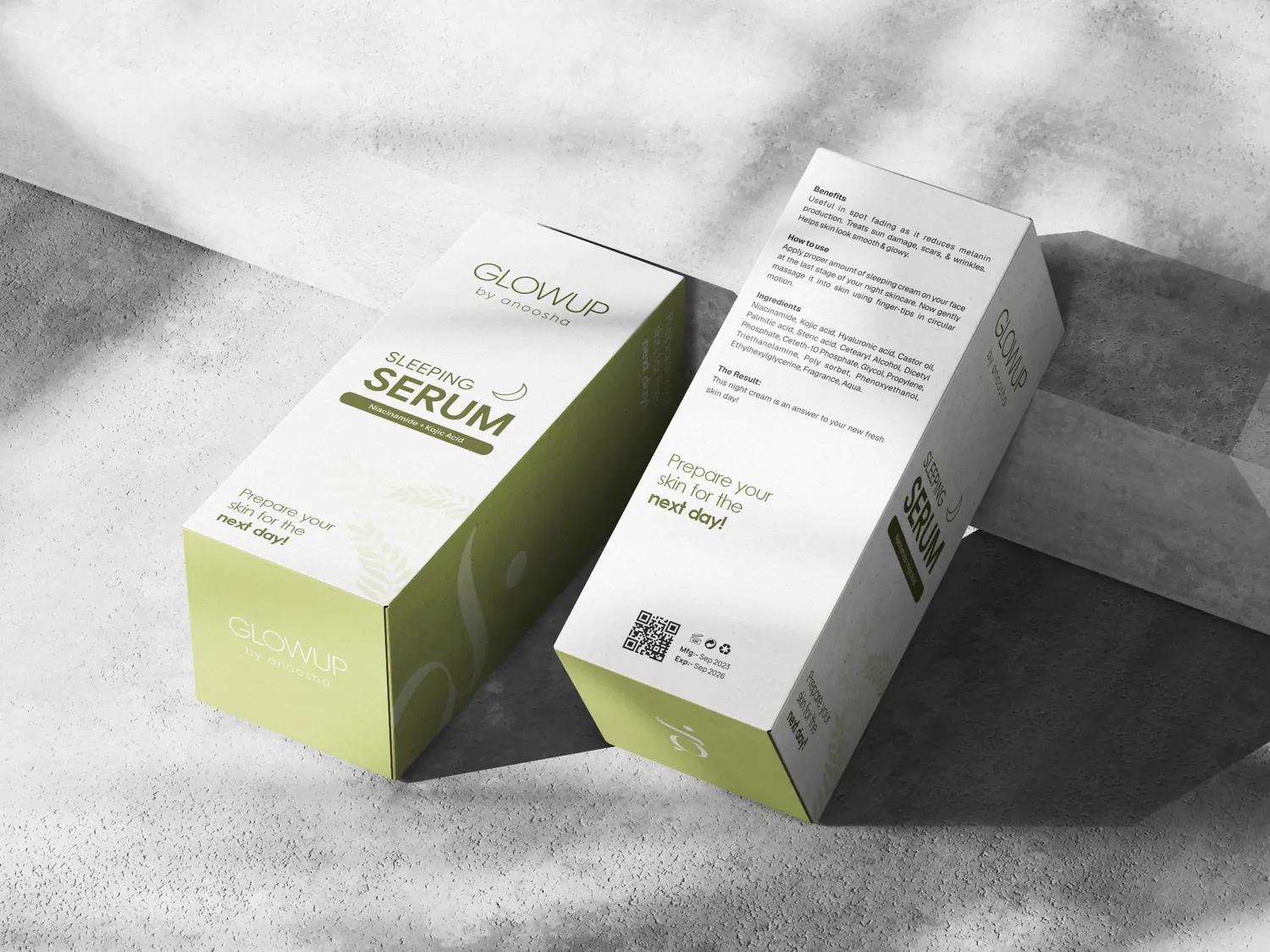
The design direction balances a fresh, botanical personality with the clarity expected from a skincare product. A restrained palette and generous white space create a premium feel, while the crescent-moon and leaf details connect the identity to a night-time care ritual.
Muted sage, deep olive and warm white work together to create a recognisable visual system across the packaging range.
A clear hierarchy gives the GLOWUP name presence, makes the product type easy to scan and keeps ingredient callouts distinct.
The carton design carries the brand across front, side, back and top panels. Product information, directions, ingredients and traceability details are organised within a consistent visual framework.
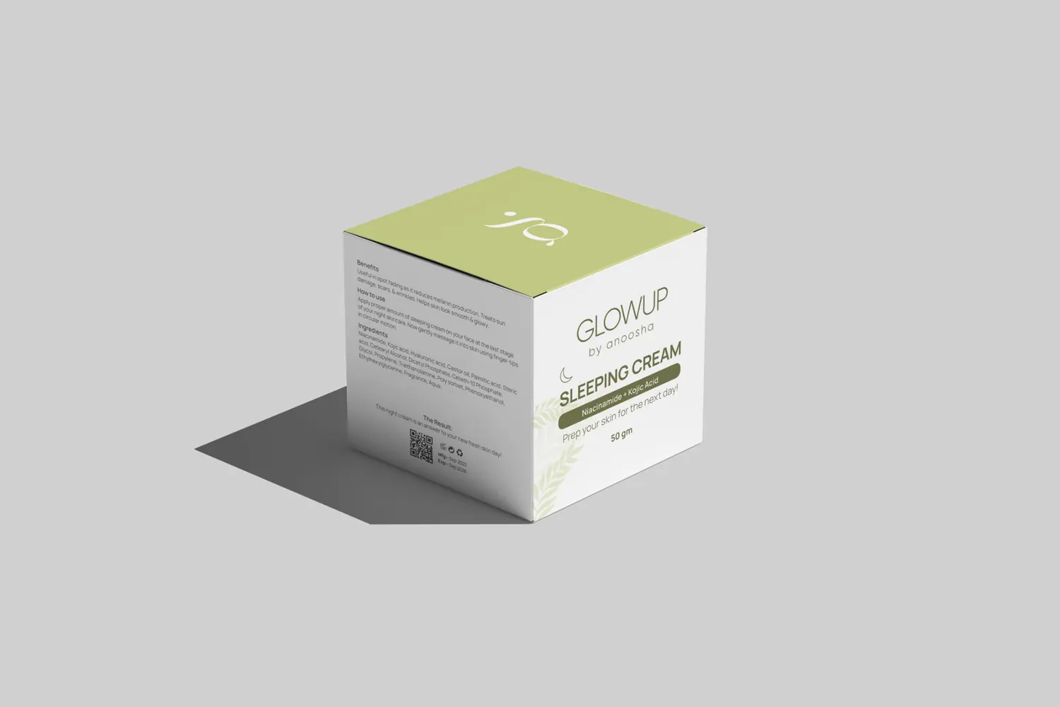
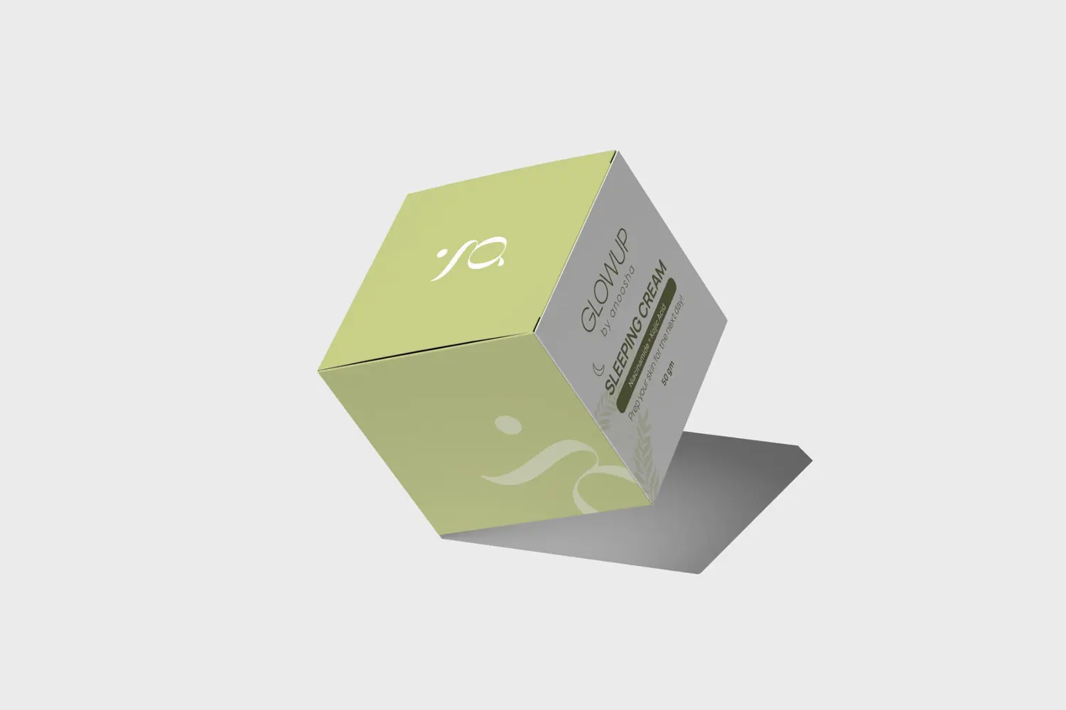
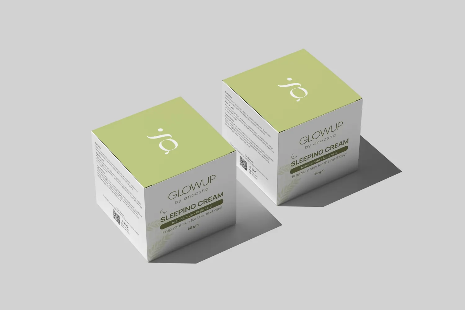
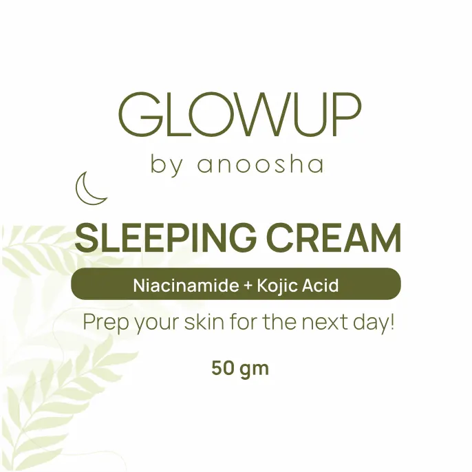

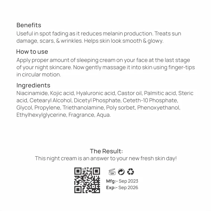
The cream jar uses a clean white body and olive lid to echo the carton palette. The label keeps the brand name, product descriptor and active-ingredient message prominent in a compact format.
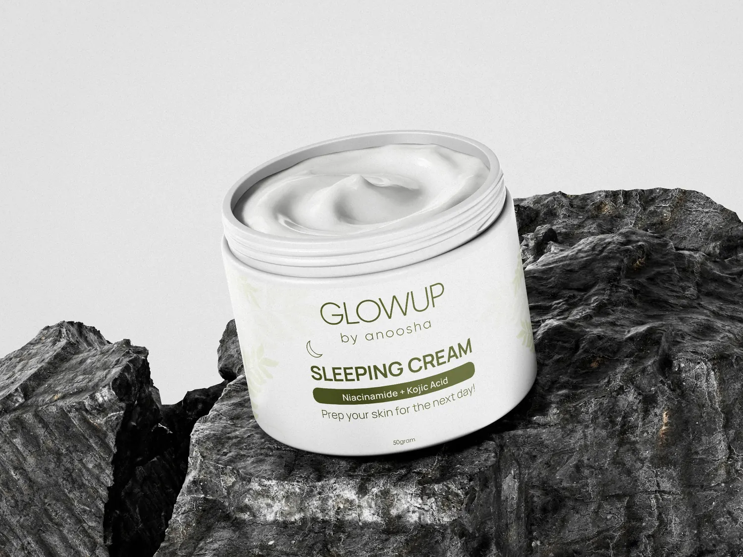
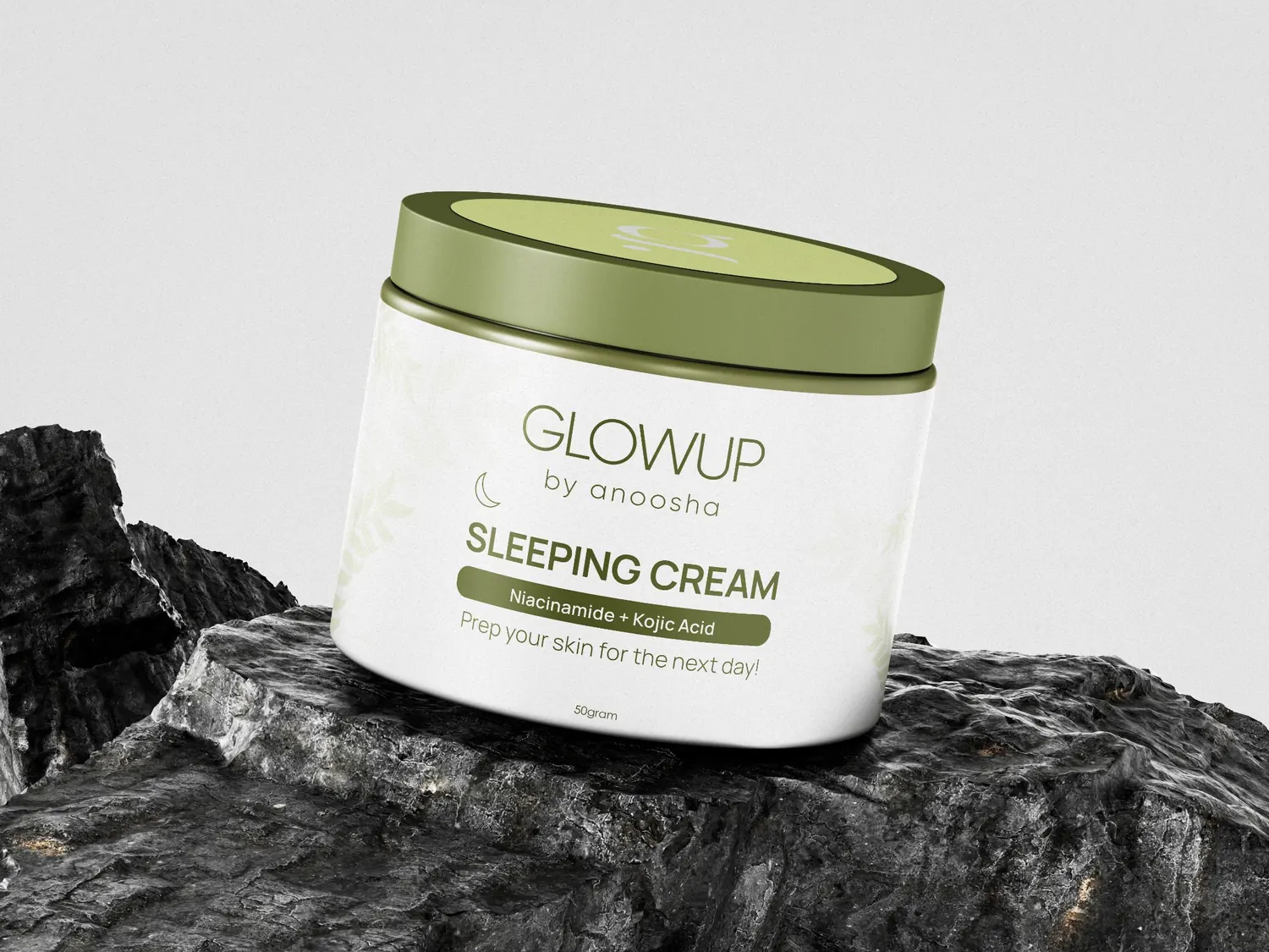
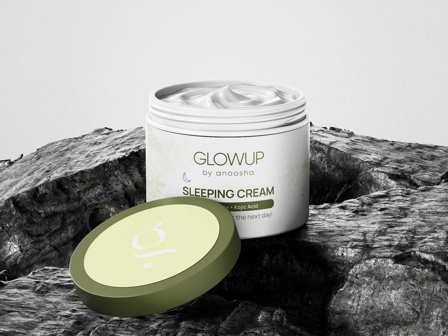
Product-led campaign imagery explores dreamy night-time cues, lifestyle placement and imaginative skincare storytelling — keeping the packaging at the centre of each visual.
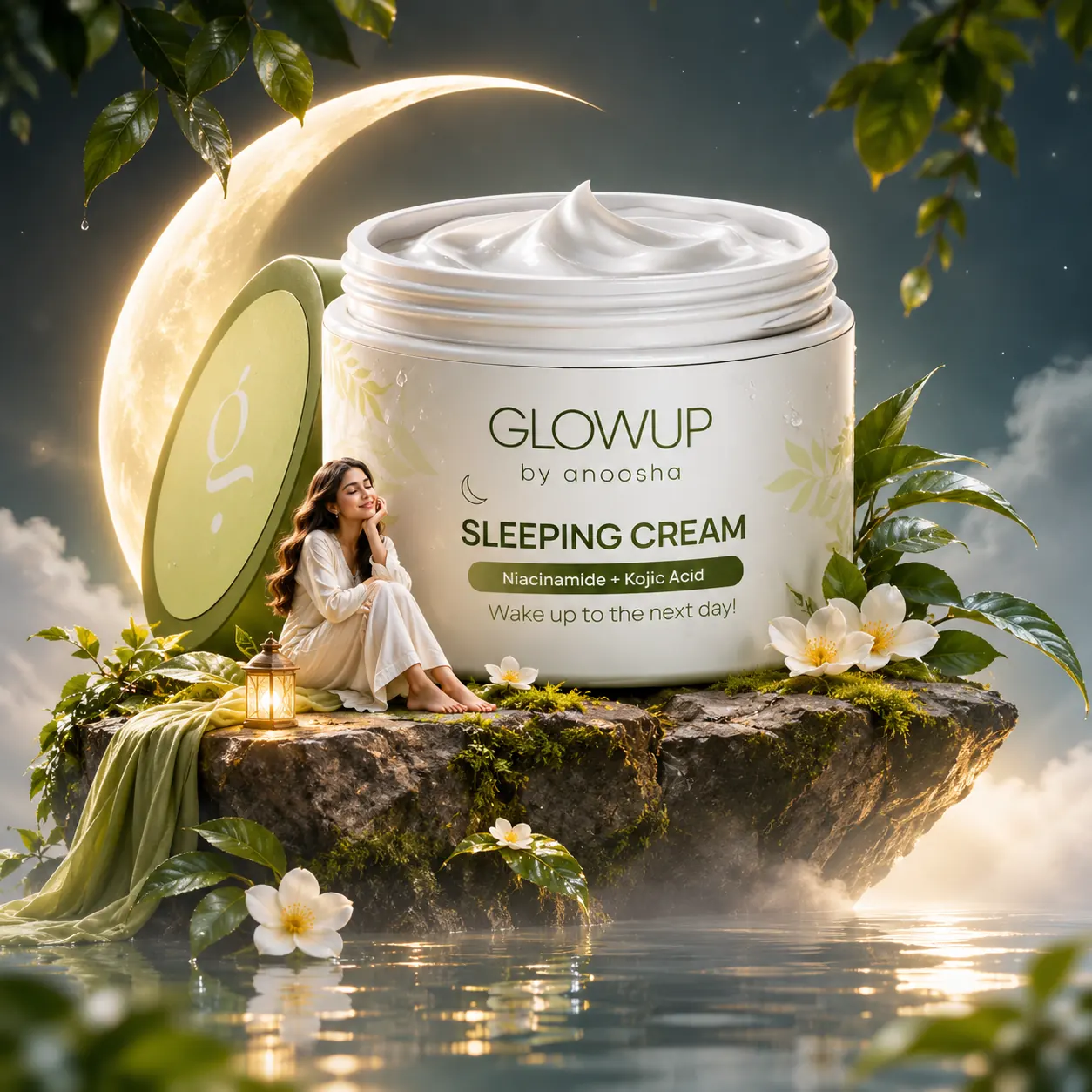
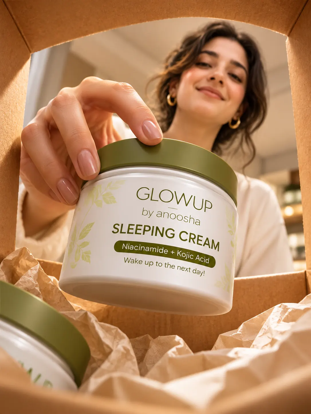
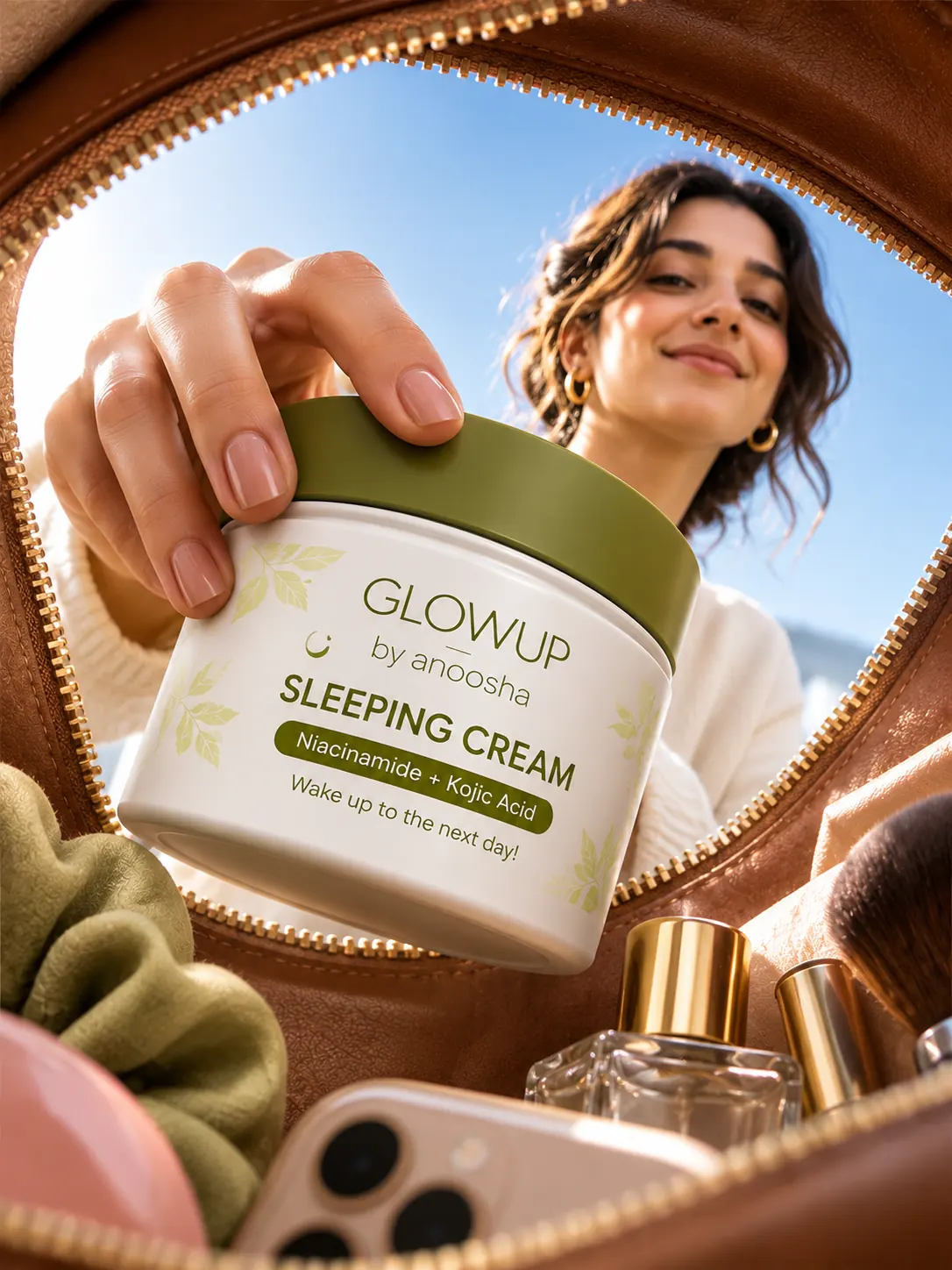
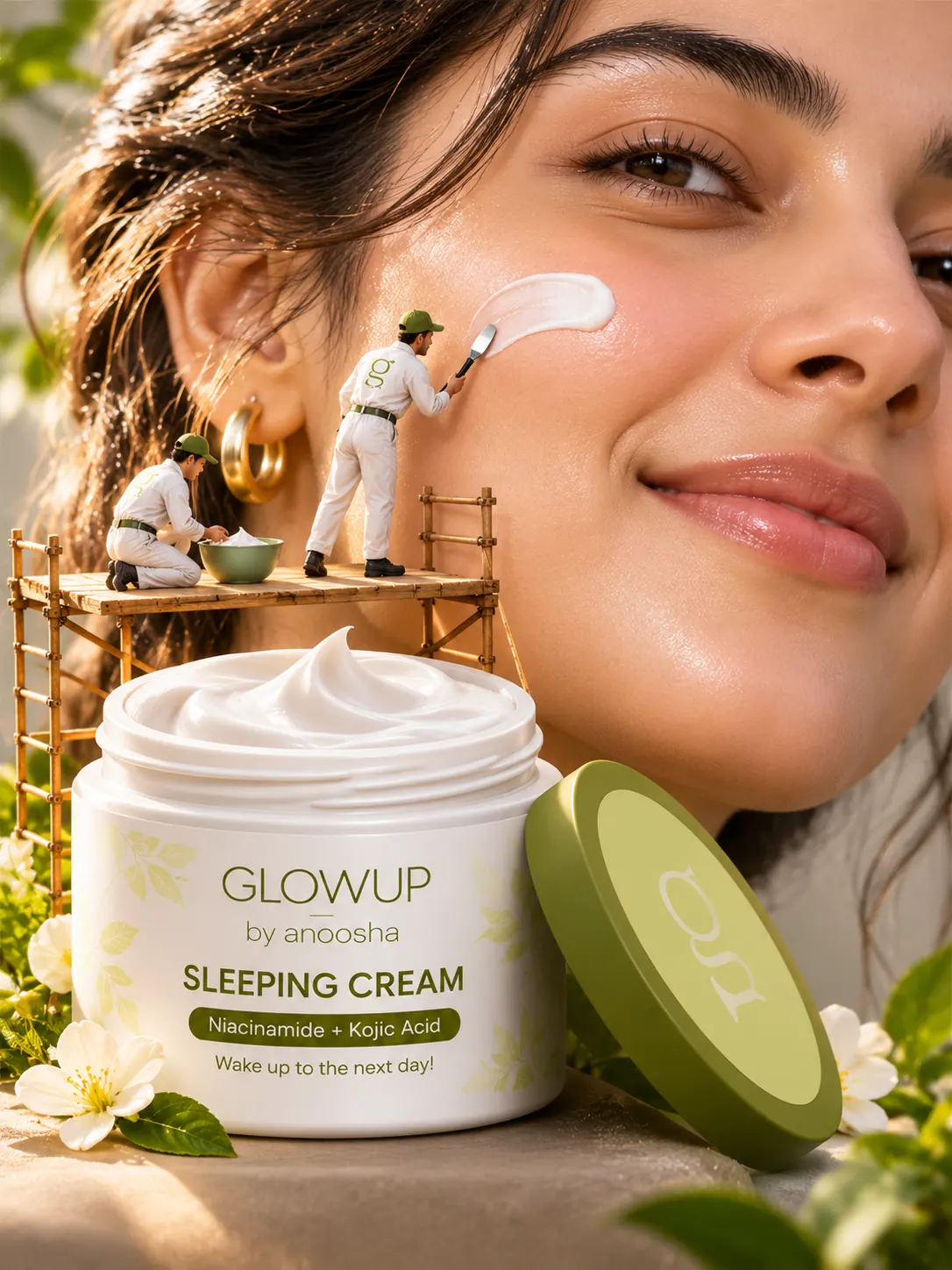
The project combines brand thinking, packaging architecture, product visualization and campaign development into one coherent presentation.
Set the visual tone, product personality and overall design language.
Develop the layout, information hierarchy and panel artwork.
Show the carton and jar through considered product views.
Translate the identity into promotional and lifestyle imagery.
The result is a connected brand presentation spanning carton packaging, jar design, product visualization and campaign imagery — grounded in a consistent palette, considered typography and botanical detail.